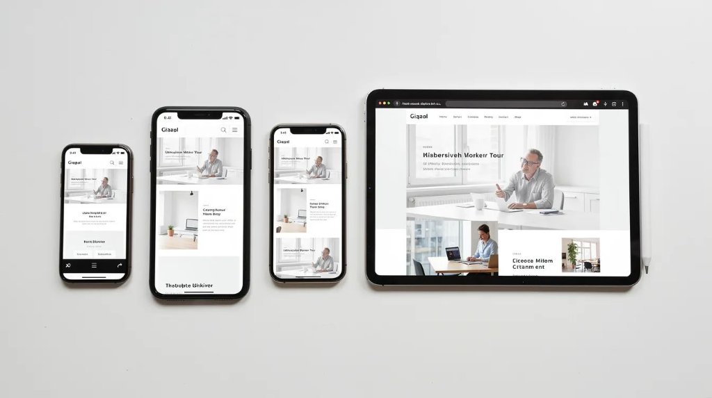
Key Takeaways
- In 2026, a responsive web designing company must deliver seamless, fast experiences on mobile devices first, then tablets and desktops—this is the baseline expectation, not a premium feature.
- Responsive design directly impacts lead generation, SEO visibility, and revenue; poor mobile experience actively costs businesses conversions and search rankings.
- The best partners combine custom web design, modern tech like CSS Grid and responsive images, and ongoing optimisation into one integrated service.
- When selecting an agency, prioritise real client testimonials, measurable case studies with specific business outcomes, and a transparent design process over vague promises of 'beautiful design.'
- This guide provides a concrete checklist to evaluate responsive web design companies and avoid costly redesigns that fail to deliver across various devices.
Introduction: Why Your Business Needs a Truly Responsive Web Designing Company in 2026
The majority of your website traffic now arrives from mobile devices. Google's mobile-first indexing has been fully operational for years, meaning your mobile experience is what determines your search engine rankings. User expectations for digital experiences have risen sharply—people expect sites to load fast, look professional, and work flawlessly whether they're on a phone during their commute or a desktop computer in the office.
A responsive web designing company does far more than apply templates that shrink to fit smaller screens. The primary task of a responsive web design agency is to design and develop websites that offer optimal user experience across different devices, leveraging advanced tools and technologies to ensure all elements are easily navigable. This means strategy, UX research, custom web design, mobile-first development, and continuous optimisation working together as integrated services.
Responsive web design is essential in today's mobile-first world, as it ensures websites automatically adjust to the device being used, providing an optimal user experience. If your current site was built without this foundation, you're likely losing leads, damaging your brand identity, and watching competitors outrank you in search.
This article gives practical, non-technical guidance for business owners and marketing teams evaluating responsive web design services. By the end, you'll have a clear framework for selecting a partner that delivers measurable business growth—not just a new website that looks nice on your laptop.
What Is Responsive Web Design Today? (Beyond Just Shrinking to Fit)
Responsive web design is the approach that ensures web pages perform well on various devices and screen sizes. But in 2026, this definition only scratches the surface of what responsive design actually involves.
Core Technical Principles
Real Device Testing Is Non-Negotiable
A professional responsive web design agency doesn't rely solely on browser developer tools to test how sites appear on different devices. Testing is an integral part of developing a responsive website, ensuring that the site performs optimally on various browsers and devices through rigorous testing protocols. This means maintaining device labs with actual mobile phones, tablets, laptops, and large monitors.

Understanding the Terminology
Accessibility as Core Component
Modern responsive design includes accessibility standards by default, not as an expensive add-on. WCAG 2.2 compliance—encompassing semantic HTML, proper heading hierarchies, sufficient colour contrast, keyboard navigation, and screen reader compatibility—is now expected as part of responsive web design solutions.
Why Responsive Design Is Critical for Revenue, Leads, and Brand Trust
Responsive design has evolved from a technical best practice to a commercial necessity. The connection between your site's performance on mobile devices and your bottom line is now measurably direct.
Mobile-First Experience Drives Lead Generation
Mobile traffic represents 50-70% of total website visits across most industries in 2026. When forms are difficult to complete on phones, buttons are too small to tap accurately, or navigation is confusing on smaller screens, you're creating friction that prevents conversion. A responsive website can significantly improve user engagement and conversion rates by providing a seamless experience across various devices.
Search Visibility Depends on Mobile Performance
Google prioritises responsive web design in its search rankings. Mobile-First Indexing means Google primarily crawls and indexes the mobile version of your website when determining rankings.
Core Web Vitals targets for mobile:
Brand Trust Erodes on Poor Mobile Experiences
When users encounter tiny buttons impossible to tap, text requiring horizontal scrolling, or navigation that collapses confusingly, they form immediate impressions about your business. Research shows that 38% of users disengage with unattractive website layouts. Your digital presence shapes brand perception—and for most prospects, that perception forms on a phone screen first.
Core Services You Should Expect from a Responsive Web Designing Company
A serious responsive web design agency offers an integrated suite of digital solutions. Responsive web design services include designing, developing, testing, and maintaining websites that adapt to various screen sizes and devices.
Strategy and UX Research
Stakeholder workshops, analytics review, user research, and journey mapping to ensure design decisions serve actual user needs rather than designer preferences.
Custom Web Design
Bespoke design systems with typography scales, colour systems, component libraries, and documentation—tailored to your brand identity and industry.
Responsive Front-End Development
HTML5 semantic markup, CSS3 with media queries, JavaScript frameworks, and CMS integration (WordPress, Webflow, Shopify, WooCommerce).
Performance and SEO Integration
Image optimisation using WebP/AVIF, lazy loading, technical SEO setup, schema markup, and site structure optimised for both users and search engines.
Testing and Maintenance
Cross-browser and cross-device testing, accessibility audits, Core Web Vitals performance testing, and security reviews.
Inside the Design Process: How a Professional Agency Builds Responsive Sites
A predictable, documented design process reduces risk, prevents delays, and ensures clear communication throughout your project.
Discovery Phase
Stakeholder workshops, competitive analysis, analytics review, and a current site audit. This phase typically spans 2–4 weeks for mid-size projects.
Information Architecture & Wireframing
Mobile-first wireframes establish content hierarchy and interaction patterns for the smallest screens first, then expand for tablet and desktop.
Visual Design
Creating design systems, designing page templates mobile-first, specifying interactive states, and building interactive prototypes. Typically spans 4–8 weeks.
Development & Integration
Front-end developers implement designs in production code, integrating CMS, forms, analytics, CRM, and performance enhancements. Typically 6–12 weeks.
QA & Launch
Device lab testing, Core Web Vitals optimisation, accessibility verification, security reviews. Launch is increasingly phased to catch unexpected issues.
Case-Style Outcomes: What Effective Responsive Web Design Achieves
When evaluating responsive web design companies, look for hard numbers, specific dates, and measurable business outcomes—not vague claims about "beautiful design."

B2B Manufacturing
+31% web traffic
30% increase in new users within 6 months (Jones Metal Products / Split Reef)
Energy Sector
+63% engagement
27% more visitors, 63% engagement lift (Puma Energy / Digital Silk)
Tech Startup
$40M Series B
Investment raised after responsive redesign enabled home customisation across all devices (Mighty Buildings / Halo Lab)
How to Choose the Right Responsive Web Designing Company for Your Brand
Selecting a web design company is one of the most consequential decisions you'll make for your digital footprint. Use this practical checklist during vendor evaluation.
Review Portfolios with a Critical Eye
Look for variety of industries, recent projects (2023–2026), and mobile/tablet/desktop views. Visit portfolio sites on your phone—the ultimate test.
Verify Technical Expertise
Ask about mobile-first development, CSS architecture, Core Web Vitals approach, CMS experience, accessibility standards, and real device testing.
Request and Verify Client Testimonials
Strong testimonials reference specific outcomes: lead generation increases, traffic growth, conversion improvements, collaboration style, and post-launch support.
Establish Measurable Goals Upfront
Ensure the agency commits to target page load speeds, Core Web Vitals scores, conversion rate improvements, lead volume targets, and timeline milestones.
Prioritise Post-Launch Services
Ask about support packages, response times, continuous optimisation offerings, and how they handle new device sizes or browser updates.
How Responsive Web Design Supports Your Broader Digital Marketing
A responsive website is the hub for all digital marketing activities, from organic search to paid campaigns and social media. Landing pages built with responsive design convert significantly better from paid ads across iOS and Android devices. Poor mobile experience on landing pages wastes significant ad spend through high bounce rates and abandoned conversions.
Responsive design and SEO work together: proper heading hierarchies help search engine crawlers understand content organisation, schema markup enhances how pages appear in search results, and fast page load speed improves rankings and click-through rates. Cross-device tracking via analytics, heatmaps, and event tracking reveals where to refine user journeys—identifying pages where mobile bounce rates exceed desktop, or forms with higher abandonment on phones.
The most effective approach plans design, copy, and tracking together rather than in silos. When a responsive web design agency understands your broader marketing goals, they can build a new website that supports the entire customer journey—making your responsive website a platform for business growth rather than just a digital brochure.
Frequently Asked Questions
How much does it typically cost to hire a responsive web designing company in 2026?
Small brochure sites (5–10 pages) typically range from $5,000–$15,000. Mid-size marketing websites usually fall between $15,000–$50,000. Large ecommerce platforms or complex web applications often exceed $50,000. Ongoing optimisation and support are usually billed via monthly retainers—typically $500–$5,000+ monthly depending on scope.
How long will it take to redesign my existing website to be fully responsive?
A simple responsive refresh with content already prepared might take 6–8 weeks. A full redesign typically requires 12–16 weeks. Complex ecommerce platforms or multilingual builds often extend to 4–6 months. Allow extra time for thorough testing on real devices.
Can my current CMS be used for a modern responsive redesign?
In many cases, WordPress, Shopify, or other common CMS platforms can be retained with a completely new responsive front-end. Platform changes become advisable when you face performance bottlenecks, security vulnerabilities inherent to the platform, or rigid template systems blocking design improvements.
How do I know if my existing site is hurting my lead generation on mobile devices?
Compare bounce rates and conversion rates between mobile and desktop in your analytics. Run key pages through Google PageSpeed Insights—scores below 50 on mobile indicate serious issues. Manually complete your own forms on a phone, and note any frustrations.
What ongoing work is needed after launching a responsive website?
Performance tuning to maintain Core Web Vitals, content updates, UX refinements based on user behavior data, security patches, A/B testing, and device compatibility checks. Budget for continuous optimisation—the cost far exceeds the expense of periodic major redesigns required when sites are neglected.
Selecting the right responsive web designing company is one of the most impactful decisions you'll make for your digital presence in 2026. Start by auditing your current site's mobile performance. Use the evaluation checklist in this article to assess potential partners against specific criteria: portfolio quality, technical expertise, client testimonials, and commitment to post-launch optimisation. The businesses seeing 30%+ traffic improvements and dramatic engagement increases from responsive redesigns aren't lucky—they're working with partners who understand that responsive web design in 2026 is about delivering measurable business outcomes across every device your target audience uses.
Ready to Work with a Responsive Web Designing Company?
Book a free consultation with our team. We'll audit your current site's mobile performance and outline a clear path to better rankings, more leads, and stronger brand trust.